Explainer Video Examples: 12 B2B Picks (+Cost)
The 12 B2B explainer videos embedded below are among the strongest currently live across SaaS, CRM, project management, and dev tools. Each covers a different product category, animation style, and budget tier. Study the patterns and you will leave with a tighter brief and a clearer sense of what a realistic investment looks like before your first agency call.
Table of Contents
Key Takeaways
- 12 verified B2B explainer videos embedded directly below — each from the company's official YouTube channel.
- 8 of the 12 use 2D animation; the remaining 4 use live-action, screen recording, or mixed-media formats.
- 60–90 seconds is the target runtime for top performers — Wistia's engagement research shows completion rates decline steeply beyond the 2-minute mark.
- $3,000–$25,000+ is the realistic production range for a professional B2B explainer depending on style and team type.
- Every high-performing example leads with a pain point, shows the solution working within 30 seconds, and closes with a single clear CTA — never a feature list.
What Makes a B2B Explainer Video Work?
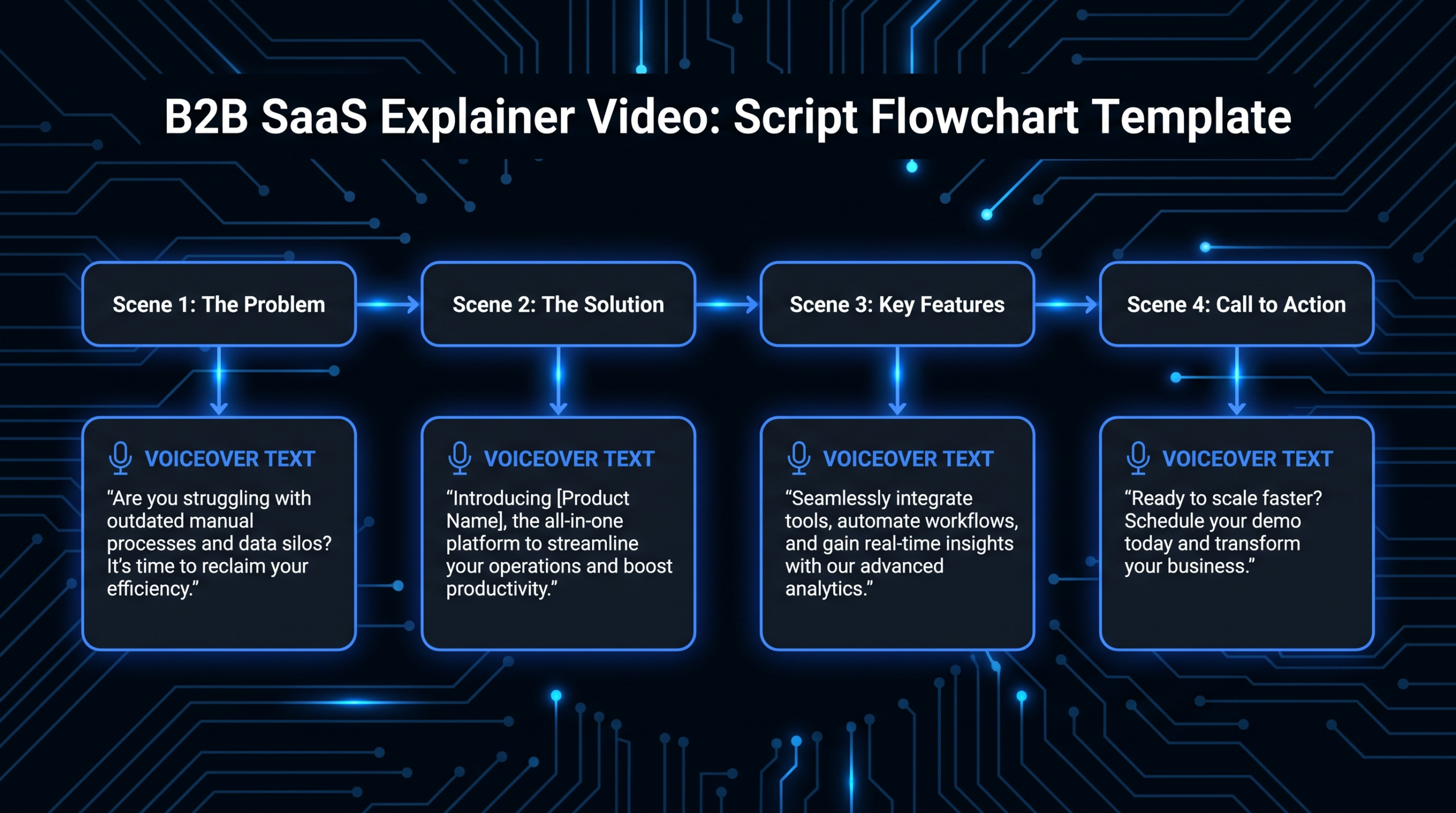
A B2B explainer that converts does four things precisely: it names a specific problem the buyer already feels, shows the solution working in under 30 seconds, backs the claim with a social proof signal or concrete outcome, and ends with one action. Videos that try to pack every feature into 90 seconds fail on all four.
The single biggest differentiator between the top SaaS explainers and everything else is perspective shift: the best ones put the viewer — not the product — at the center of the story. By the time the logo appears, the viewer is already sold on the problem being real. The product is introduced as the answer to a question they were already asking.
For context on where explainer videos fit inside a broader SaaS video production program, each format serves a different stage: explainers build problem awareness at the top of funnel; product demo videos qualify intent in the middle; customer testimonials close at the bottom. Mixing up these roles is the most common reason an expensive explainer fails to move pipeline.
The 12 examples below show how companies with very different products, audiences, and budgets have solved this same challenge — and what specific technique you can take from each one.
12 B2B Explainer Video Examples (Embedded)
Each example is embedded from the official YouTube channel. Notes cover style, estimated production budget, what they did right, and the single most transferable technique for your own brief.
1. Dropbox — The Original Benchmark
What they did: Dropbox embedded this whiteboard-style explainer on their beta waitlist page in 2009. Produced by Common Craft, it explained a single concept — "your files everywhere, in sync" — without a single product screenshot. The script answered one question: why is this different from emailing yourself?
Why it worked: The conversion lift from this page drove significant early sign-up volume and shaped Dropbox's funding narrative. The result was heavily documented as an early content-driven growth case study. One clear problem, one clear solution, no feature list.
Borrow this: Single-problem focus. Every additional problem you try to address in your explainer cuts conversion. Pick the one pain point your champion will bring to the buying committee and solve only that.
2. Slack — Documentary Trust Format
What they did: Slack's explainer follows a real team adopting the platform. Documentary format: interviews, screen recording, on-screen annotations, and natural office footage showing actual workflow transformation.
Why it works: Decision-makers buying collaboration tools are already skeptical of polished demos. Seeing real people — who are initially skeptical — become converts is more persuasive than a scripted walkthrough. The format validates itself by showing doubt, not just adoption.
Borrow this: In trust-heavy categories — security, compliance, communication tools — live-action documentary format will outperform 2D animation. If your product is a workflow change, show the workflow changing for someone real.
3. HubSpot — Speaking to the Economic Buyer
What they did: HubSpot's platform overview positions the product for the economic buyer — VP Revenue, COO — not the end user. Motion graphics show the CRM, Marketing Hub, Sales Hub, and Service Hub as a single connected revenue system. Feature-level depth is absent by design.
Why it works: Procurement-led buying cycles run on a different question than end-user adoption: "will this consolidate our stack and give us visibility across the funnel?" The video answers that question specifically without requiring any product knowledge to follow.
Borrow this: If your product has a technical buyer and a business buyer, your top-of-funnel explainer should win the budget conversation. Deep feature content belongs in a separate demo, not in the explainer.
4. Notion — UI-Led with Character Moments
What they did: Notion layers animated character moments on top of a UI-led product animation. The characters appear at emotional beats — not as the main story driver — while the actual product animation carries the explanation of what you can build.
Why it works: A blank-canvas tool is uniquely hard to explain in under 2 minutes. Showing the "what can I build" moment visually — rather than describing it — makes an abstract product tangible without turning it into a tutorial.
Borrow this: Character animation is a support element, not a lead. Use it to add personality at emotional moments. Let the product demo carry the substance of the explainer.
5. monday.com — Physical-to-Digital Transition
What they did: monday.com opens with live footage of a real physical workspace, then seamlessly transitions into 2D animated screencasts of the product. Mixed-media direction communicates the core value proposition visually: bring the complexity of real work into a structured, visual platform.
Why it works: The physical-to-digital transition is a visual metaphor for exactly what the product does. Buyers see their current world — whiteboards, sticky notes, chaotic handoffs — and then see it resolved inside the product, all in one unbroken visual sequence.
Borrow this: Mixed-media formats cost more but resolve the highest credibility gap — "does this actually work for teams like mine?" Show the real-world context first, then the product as the resolution.
6. Zendesk — Aesthetic as Positioning Signal
What they did: Zendesk blends stop-motion photography, 2D animation, collage, and dashboard simulations into a narrative about customer relationships. The visual language is warm, tactile, and deliberately unlike every other enterprise software explainer.
Why it works: Customer support is a cold-feeling category — ticket queues, SLAs, escalation matrices. Zendesk's aesthetic is a direct counter-signal: "we think about human relationships, not systems." The style is itself a product claim about company values, made without a single word of copy.
Borrow this: Your visual style is part of your positioning. If all competitors use clean flat animation, a genuinely different aesthetic can make you more memorable than any individual feature point — even to buyers who cannot articulate why.
7. Asana — Problem-First Hook
What they did: Asana opens with a sharp statement about collaboration failure: emails lost, tasks dropped, no one knowing who owns what. The product appears as the resolution to a problem the viewer already recognizes — not as the hero of the story.
Why it works: The problem is named, felt, and validated before any skepticism about the solution can form. Buyers who recognize themselves in the opening pain are already receptive to the product by the time it is introduced at the 20-second mark.
Borrow this: Lead with the cost of the problem, not the capability of the product. Buyers invest in solutions to pain they already feel, not benefits they must first be convinced to want.
8. Airtable — Clarity Over Polish
What they did: Airtable's explainer prioritizes clarity over visual polish. Clean screen recordings with lightweight motion-graphics overlays show the product's flexibility — database power with spreadsheet familiarity — without requiring any technical background to follow.
Why it works: "Spreadsheet meets database" is a concept that breaks down when explained in text or abstract animation. Screen-based formats let the product teach itself. Buyers watching themselves interact with a familiar interface are closer to signing up than buyers watching a polished animation of someone else using it.
Borrow this: For tools with a steep initial learning curve or an abstract value proposition, screen-based formats reduce cognitive load and accelerate time-to-comprehension better than pure animation.
9. Loom — Self-Referential Framing
What they did: Loom explains itself using the type of videos people actually use Loom to make — casual, direct, peer-to-peer. Real users, real screen recordings, real use cases. The format mirrors the buying motion: Loom videos spread virally inside companies when one person shares one with a colleague.
Why it works: Self-referential formats work when the product's primary distribution mechanism is sharing. Buyers feel like they discovered Loom from a colleague, not that Loom marketed to them. That framing is hard to manufacture with traditional animation.
Borrow this: For tools that spread through product-led or viral-sharing motions, build your explainer to mirror how the product actually gets adopted — not how it gets sold.
10. Webflow — Analogy-Driven Humor
What they did: Webflow uses a real-world analogy: what if everyday life worked like bad web design? Objects disappear randomly. Furniture ignores gravity. Nothing does what you expect. The humor lands because every marketer and designer has lived this frustration.
Why it works: Analogy is the most efficient compression format in explainer video. One relatable real-world scenario communicates the full value proposition in under 10 seconds — no jargon required. When the relief comes (Webflow appearing as the solution), the contrast is visceral.
Borrow this: If your product solves a universally frustrating, familiar problem, the fastest path to "I need this" is humor built on shared pain. Lead with the frustration; let the product be the punchline.
11. GitHub — Broadening Beyond the Technical Buyer
What they did: GitHub's explainer reframes who the platform is for. Instead of targeting developers exclusively, the video positions GitHub as essential for any company that builds software — opening the audience to engineering leaders, CTOs, and business buyers who control the budget.
Why it works: The scope expansion ("every company is a software company now") justifies enterprise pricing to non-technical decision-makers. The animation shows GitHub powering everything from business applications to space missions — each one a signal to a different stakeholder reading the budget proposal.
Borrow this: If your product has a technical champion and a business buyer, your explainer should speak to both. The champion gets the features demo; the explainer wins the budget conversation before they ever get to IT procurement.
12. Salesforce — Outcome-First Enterprise Positioning
What they did: Salesforce's 2024 explainer has pivoted fully to AI-first positioning. The video centers on "the #1 AI CRM" and uses product UI walkthroughs to show AI agents working across sales, service, and marketing — with business outcomes named at every transition.
Why it works: The AI framing directly addresses the CFO's question: "what is the ROI on this platform?" Outcome-focused language ("close more deals", "personalize at scale", "reduce handle time") beats feature descriptions in procurement-led buying cycles where no single person understands the full product depth.
Borrow this: In 2026, the strongest enterprise explainers lead with business outcomes and use AI as leverage proof — not as a feature. Show the output the AI delivers, not the model architecture. If your product has an AI component, frame it as "your team working at 10x capacity," not as "our proprietary AI."
Should You Use Animation or Live-Action?
The 12 examples above split roughly 8-to-4 in favor of animation — not because animation is inherently superior, but because it scales better for multi-market deployment, does not require location logistics or talent sourcing, and allows infinite UI animation without a live designer onscreen. Here is how the formats compare on the factors that matter most for B2B buyers.
Animation vs. Live-Action for B2B Explainers
| Factor | 2D Animation | Live-Action | Mixed Media |
|---|---|---|---|
| Best for | Abstract concepts, global markets, reusable assets | Trust-heavy categories, viral tools, community-driven products | High-budget brands, physical-to-digital products |
| Cost range | $5,000–$30,000 | $3,000–$40,000 | $15,000–$80,000+ |
| Production time | 4–10 weeks | 2–6 weeks | 6–14 weeks |
| Shelf life | 2–4 years (style-dependent) | 12–24 months (ages faster) | 2–4 years |
| Localization cost | Low — re-record voiceover, swap text layers | High — reshoot scenes or awkward overdubs | Medium |
| UI showcase quality | Excellent — custom animated UI | Functional — screen recording overlay | Excellent — both options available |
For most B2B SaaS companies at Series A–C stage, a 60–90 second 2D animated explainer with a professional voiceover is the highest-ROI starting point. For SaaS-specific creative direction and production considerations, see our SaaS explainer video guide. For companies scaling to consistent monthly video output — explainers, demo cuts, social versions, update refreshes — a dedicated video editing team will cost less per deliverable than commissioning standalone projects.
How Much Does a B2B Explainer Video Cost?
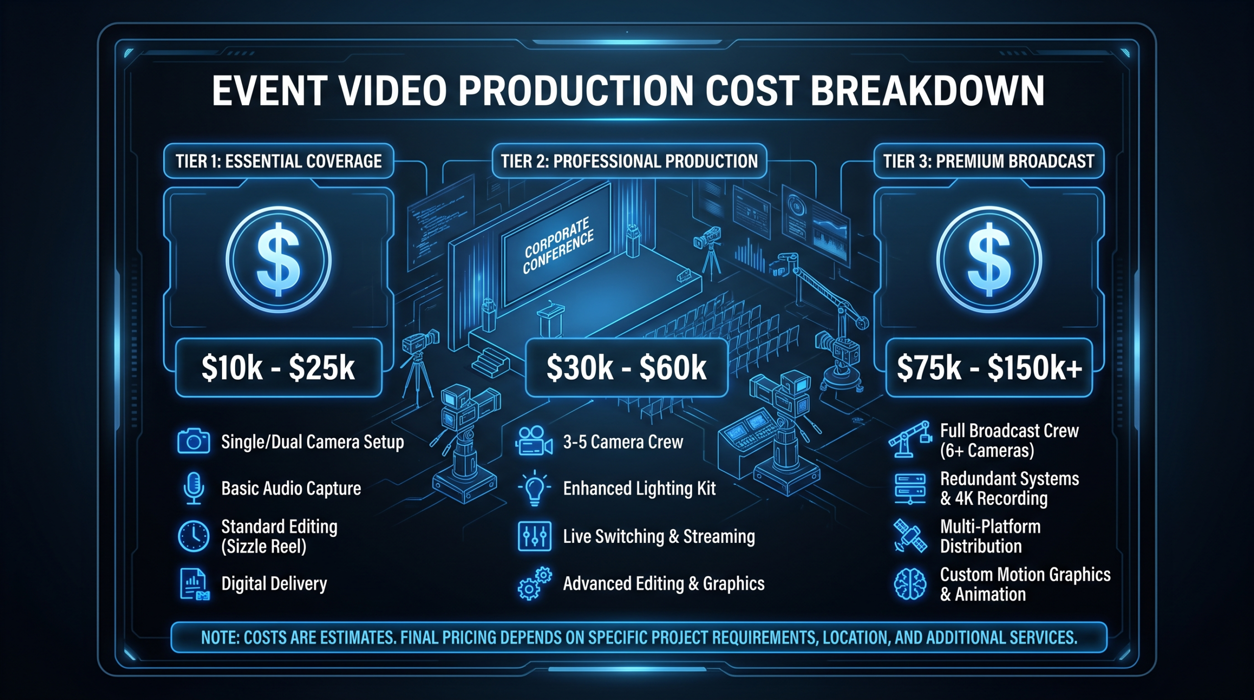
The cost range for B2B explainer videos is wide — and the gap between the lowest and highest quotes for the same brief can exceed $20,000. The primary drivers are animation style, script complexity, number of revision rounds, and whether you are working with a freelancer, boutique agency, or full-service studio.
B2B Explainer Video Cost by Production Type
| Production Type | Price Range | Turnaround | What's Included |
|---|---|---|---|
| DIY / AI-assisted tools | $500–$2,000 | 1–2 weeks | Template animation, AI voiceover, limited brand customization |
| Freelancer (Upwork / Fiverr) | $1,500–$5,000 | 2–4 weeks | Custom script and animation, single editor, limited revisions |
| Boutique agency | $5,000–$15,000 | 4–8 weeks | Strategy, script, storyboard, custom 2D animation, professional voiceover |
| Mid-market agency | $10,000–$30,000 | 6–12 weeks | Full creative direction, brand-aligned style guide, multiple structured revision rounds |
| Top-tier studio | $25,000–$100,000+ | 8–20 weeks | Premium 2D/3D animation, original soundtrack, A-list voiceover, enterprise revision process |
| Dedicated editing team (retainer) | $5,000–$16,000/mo | Ongoing delivery | Monthly explainer updates, demo cuts, social versions, and refreshes — no per-project billing |
The hidden cost most B2B teams miss is post-production revision burn. A $15,000 explainer can reach $22,000+ if the brief was not tight enough to lock the script in round one. Teams working with a dedicated video partner — like VEC's Growth ($5K/mo), Core ($9.5K/mo), or Scale ($16K/mo) plans — get explainer updates, refresh cuts, and social versions included rather than paying project rates every time a product feature changes or a pricing page updates.
For a complete tier-by-tier breakdown of what drives explainer video pricing — including per-minute rates, style multipliers, and the actual production difference between a $5,000 and a $50,000 finished video — see our dedicated explainer video cost breakdown.
If you are producing a consistent volume of B2B video content — explainers, demo videos, testimonials, social cuts — our video production pricing models guide shows how the per-video economics change at different monthly volumes and which pricing structure makes the most financial sense at each stage. The short version: project-based pricing makes sense below ~4 videos per quarter; a retainer or dedicated team model wins above that threshold.
For context on how editing time translates into per-deliverable cost, the video editing cost per minute breakdown covers standard market rates for editing only — separate from production and animation costs. And for companies evaluating in-house versus outsourced production, what video editing services include walks through everything a dedicated team handles that an in-house headcount would not.
See VEC case studies for real-world examples of how B2B SaaS teams have scaled explainer video production without growing their internal headcount.
Frequently Asked Questions
What is a B2B explainer video?
A B2B explainer video is a short video (typically 60–120 seconds) that explains how a product or service solves a specific business problem. Unlike product demos, explainers target buyers who do not yet fully understand the problem or category — they build awareness and earn the next conversation, not close deals directly.
What is the ideal length for a B2B explainer video?
60–90 seconds is the target for most B2B explainers. Wistia's video engagement research shows completion rates decline sharply past the 2-minute mark. For complex products needing more context, keep the top-of-funnel explainer at 2 minutes maximum and produce a separate longer demo for buyers in active evaluation.
How much does a B2B explainer video cost?
B2B explainer videos cost between $3,000 and $50,000+ depending on style, length, and production team. Freelancers start around $1,500–$5,000. Professional boutique agencies charge $5,000–$15,000 for a polished 60–90 second 2D animated explainer. Top-tier studios charge $25,000–$80,000+. See our full explainer video cost breakdown for a tier-by-tier comparison with style multipliers.
Should I use animation or live-action for my explainer video?
For most B2B SaaS companies, 2D animation is the stronger starting point: flexible for UI showcasing, portable across markets, and no talent or location logistics. Live-action wins in trust-heavy categories where real people build credibility faster than characters. For a SaaS explainer video, the default recommendation is 2D animation unless your differentiation is specifically built around human connection or peer recommendation.
What should a B2B explainer video include?
A high-converting B2B explainer includes: (1) a specific pain-point hook in the first 5 seconds, (2) the solution shown — not described — within 30 seconds, (3) a social proof signal or concrete outcome around the midpoint, and (4) a single clear CTA at the end. Avoid feature lists, jargon, multiple CTAs, and anything that requires prior knowledge of your product category to follow. Every strong example in this list follows these four rules without exception.
Need a B2B Explainer Video That Actually Converts?
VEC provides dedicated video editing teams for B2B SaaS companies producing consistent content. From explainer video updates to full production pipelines, our editors work as an extension of your marketing team — with a guaranteed output increase or month 4 free.
See Pricing Book a Free Call