10 B2B Motion Graphics Examples (2026)
TL;DR
The best B2B motion graphics do one thing: make a complex product or idea immediately obvious. Below are 10 real examples from companies including Slack, Dropbox, HubSpot, monday.com, Figma, Intercom, Asana, Notion, Stripe, and Loom — each chosen to show a distinct approach that B2B marketers can replicate. After the examples, you'll find what they share, what each costs to produce, and how to plan your own campaign.
Table of Contents
- What Makes B2B Motion Graphics Actually Work
- 1. Slack — Product UI Animations That Drive Adoption
- 2. Dropbox — The Explainer That Defined SaaS Video
- 3. HubSpot — Educational Motion Graphics at Scale
- 4. monday.com — Bold Animation for a Crowded Market
- 5. Figma — Conference-Grade Motion for Product Launches
- 6. Intercom — Conversational UI in Motion
- 7. Asana — Color-Coded Motion for Workflow Clarity
- 8. Notion — Minimal Motion, Maximum Clarity
- 9. Stripe — Data Visualization in Motion
- 10. Loom — Explainer-First for a Video-Native Product
- Lessons From All 10 Examples
- Motion Graphics Style Comparison Table
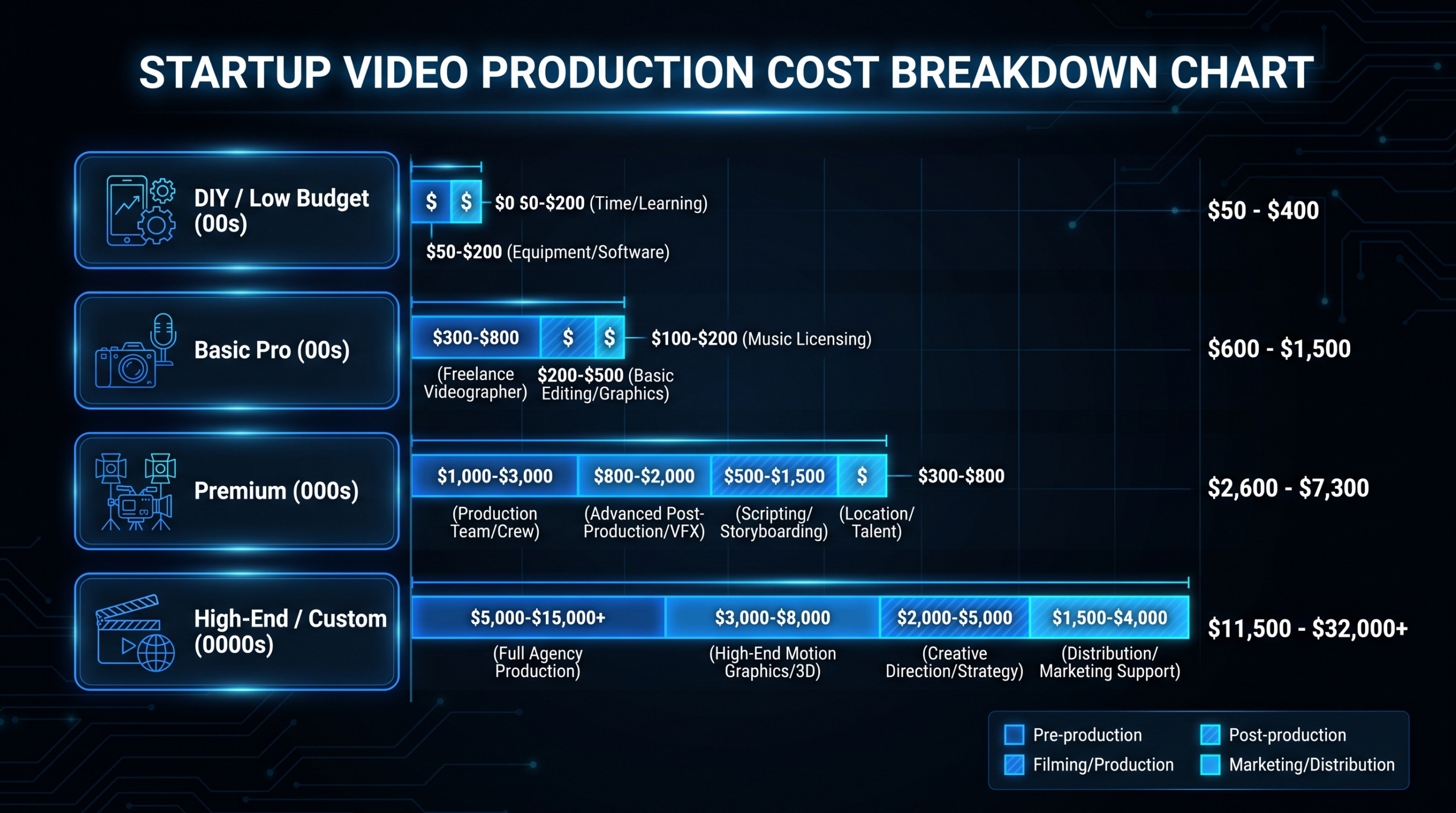
- What B2B Motion Graphics Cost in 2026
- How to Plan Your Own B2B Motion Graphics Campaign
- FAQ
What Makes B2B Motion Graphics Actually Work
B2B motion graphics fail for one of three reasons: they over-explain a product that prospects already understand, they under-explain an abstract concept that needs concrete visualization, or they optimize for "looking professional" instead of communicating clearly.
The examples below beat all three traps. Each one earned its place in marketing history — or in current best practice — because it matched animation style to communication goal. Before you look at the examples, lock in these three criteria:
- Animation serves comprehension, not aesthetics. Every motion element should answer a specific question your prospect has — not fill screen time.
- Complexity is the enemy. The best B2B motion graphics are simpler than the brief requested. Teams that understand their product deeply make short, clear videos. Teams that are uncertain about their message make long, complicated ones.
- The first 5 seconds decide everything. B2B buyers watching on LinkedIn or YouTube will skip at the first sign of a slow build or logo animation. Lead with the problem or the payoff.
With that framework in place, here are 10 real examples — each with what they did, why it worked, and what you can steal from the approach.
1. Slack — Product UI Animations That Drive Adoption
Slack's motion graphics strategy centers on animated product UI — real interface screens with motion overlays showing how messages, threads, and channels work in practice. This approach, visible across their YouTube channel and embedded in their homepage, treats the product itself as the star of the animation rather than abstract illustrations.
What They Did
Instead of building metaphor-heavy explainer animations (which dominated B2B SaaS video in the early 2010s), Slack animated their actual product interface. They show a notification arriving in real time, a channel being organized, a workflow being set up — with smooth motion graphics highlighting the exact UI elements being discussed.
The animations use Slack's purple-and-white brand palette with subtle easing curves and micro-animations that mirror what the product actually does. Nothing looks more polished than the real product.
Why It Works for B2B
Decision-makers evaluating collaboration tools need to visualize their team using the product. Product UI animation short-circuits the "I'll have to demo this" objection by showing exactly what daily use looks like — in 60–90 seconds. For enterprise buyers managing change management concerns, this reduces perceived adoption friction before the sales conversation starts.
What to Steal
If your product has a UI, animate it directly. Record high-resolution screen footage, then add motion graphics as overlays highlighting key features. Keep transitions under 0.3 seconds — fast cuts signal a product that's responsive. The total runtime sweet spot for this format is 60–90 seconds.
See their approach: slack.com/intl/en-us/videos
2. Dropbox — The Explainer That Defined SaaS Video
Dropbox's animated explainer video, created in the period when the company was in early growth (2009–2010), is one of the most cited examples in the history of SaaS video marketing. Drew Houston has described the video in interviews as a meaningful driver of signups during a period when Dropbox's primary growth mechanism was word of mouth and the waitlist.
What They Did
The original Dropbox explainer used a simple whiteboard-style 2D animation to explain a problem that was genuinely hard to describe in words: "What happens to your files when you move between devices?" The animation made the abstract (cloud sync across computers) immediately tangible by showing a stick-figure moving files from a laptop to a phone to a work computer with zero friction.
The video ran approximately 2 minutes. No product UI, no feature list, no pricing — just a relatable problem and a visual demonstration of the solution. It ended with a clear call to action to join the beta.
Why It Works for B2B
The Dropbox approach proves that abstract technical benefits — sync, accessibility, backup — can be communicated through narrative motion graphics without showing the actual product. This matters for B2B because many enterprise products solve problems that are genuinely hard to show on a screen. If your product's value is in the outcome rather than the UI, illustrative animation is the right format.
What to Steal
Lead with the problem in the first 10 seconds. Show the before-and-after using the simplest visual metaphor that makes the transformation obvious. Skip the feature list — a single, crystal-clear benefit demonstration outperforms a feature inventory every time. Target runtime: 90–120 seconds.
Learn more: dropbox.com/business
3. HubSpot — Educational Motion Graphics at Scale
HubSpot publishes motion-graphics-driven educational content across YouTube, their Academy, and the HubSpot Blog — covering topics from CRM basics to inbound marketing strategy. Their motion graphics approach uses a consistent visual system: clean white backgrounds, HubSpot's orange-and-coral palette, data visualization animations, and kinetic typography for key concepts.
What They Did
HubSpot treats motion graphics as a content marketing asset, not a product marketing asset. Their videos explain concepts like "what is a flywheel," "how to build a sales pipeline," and "what is lead scoring" — topics their ICP (marketing directors, sales managers at growing companies) searches for before they're in a buying cycle.
Each video follows a tight structure: hook question → animated concept explanation → practical application → brand mention. The motion graphics appear primarily as animated charts, process flows, and kinetic text — not complex character animation.
Why It Works for B2B
Educational motion graphics build awareness at the top of the funnel with prospects who don't yet know they need HubSpot. By the time those viewers enter a buying cycle, HubSpot's visual language is already familiar. This is the classic content marketing play, but motion graphics make the content more watchable and more shareable than text or static graphics.
What to Steal
Map your motion graphics to your buyers' most common questions — not questions about your product, but questions about the problem category you solve. Use kinetic text and animated data charts rather than complex illustration. The goal is comprehension speed, not visual impressiveness. Keep each video under 4 minutes and focused on a single concept.
See their library: youtube.com/@HubSpot
4. monday.com — Bold Animation for a Crowded Market
monday.com's motion graphics stand out in the work management software category — a space crowded with similarly positioned products — through deliberate visual differentiation. Their animations use high-saturation color (coral, indigo, canary yellow against white), fast-paced cuts, and an energetic editing rhythm that signals "this is not your typical enterprise software."
What They Did
monday.com's animated videos frequently use a hybrid approach: live-action footage of teams at work, combined with motion graphics overlays showing their product interface. The animations are deliberately casual and approachable — closer to consumer product video than traditional B2B software marketing — which was a deliberate positioning choice to differentiate from Asana, Jira, and Basecamp.
Their product UI animations show boards populating with tasks in real time, color-coded status columns updating, and team members being assigned items — with motion that feels fluid rather than step-by-step.
Why It Works for B2B
In categories where multiple products are functionally similar, motion style becomes a brand signal. monday.com's bold, fast-paced animation communicates "collaborative, modern, human" without saying those words. For buyers evaluating 3–5 similar tools, visual energy can be the differentiator that determines which demo they book first.
What to Steal
Audit your direct competitors' video style. If they're all using the same muted color palette and the same measured pacing, bold color and faster cuts will make your content unmissable in a side-by-side feed. Differentiation through motion style is an underused lever in B2B.
See their channel: youtube.com/@mondaydotcom
5. Figma — Conference-Grade Motion for Product Launches
Figma's Config conference keynote animations are widely cited in the design community as benchmarks for product launch motion graphics. Their annual Config presentations use complex, polished motion graphics to announce new features — with timing, easing, and visual storytelling that rivals consumer product launch events.
What They Did
At Config 2023 and 2024, Figma introduced major features (including AI tools, new collaboration features, and developer handoff improvements) using full-screen animated sequences that showed the feature working, visualized its impact on team workflow, and reinforced Figma's core brand value — collaboration without friction. The animations are produced at film-quality resolution with carefully choreographed timing.
These aren't YouTube-optimized 90-second explainers. They're 2–5 minute sequences designed to generate conversation in the design and product community — and they regularly appear as reference material in design and marketing forums.
Why It Works for B2B
For developer-tools and design-platform companies, your users are visually sophisticated. They notice animation quality, easing curves, and production value in a way that buyers of accounting software don't. Investing in conference-grade motion graphics for product launches signals that you care about craft — which is a direct brand message to a craft-oriented audience.
What to Steal
Tier your motion graphics investment. Day-to-day content can use templated, efficient animation. Major product launches and annual events justify conference-grade production with dedicated motion designers. Don't spend conference-grade budget on every post — but do spend it when it matters.
See their presentations: figma.com/resource-library
6. Intercom — Conversational UI in Motion
Intercom's motion graphics approach mirrors their product's personality: conversational, responsive, and immediately clear. Their explainer videos and feature animations show their messenger product as it would appear in real customer interactions — chat bubbles appearing, responses populating, automation rules triggering — with clean motion that makes the product feel alive rather than static.
What They Did
Intercom consistently uses animated product screenshots combined with kinetic text overlays to show their key use cases: customer onboarding sequences, support conversation routing, proactive outreach campaigns. The motion graphics rarely exceed 90 seconds and always end with a concrete outcome — "X% faster resolution time" or "support volume handled without adding headcount" — stated as results their customers have achieved, not invented benchmarks.
Why It Works for B2B
Customer support and messaging tools have an adoption challenge: the buyer needs to envision both their team using the tool AND their customers experiencing it. Intercom's motion graphics solve this by showing both sides of the conversation simultaneously — the support agent view and the end-user view — in a split-screen animated format that makes the workflow immediately intuitive.
What to Steal
If your product has multiple user roles (admin and end-user, seller and buyer, manager and employee), show both perspectives in your motion graphics. The "dual view" format — two interfaces side by side with synchronized motion — is underused in B2B video and highly effective for tools with multiple stakeholders.
See their resource library: intercom.com/blog/videos
7. Asana — Color-Coded Motion for Workflow Clarity
Asana's motion graphics lean into their core product metaphor — color-coded task organization — throughout all their visual content. Their animations use Asana's signature warm coral, teal, and navy palette to visually organize information the same way their product does: by color, category, and status.
What They Did
Asana's product animations show tasks moving through workflows, deadlines appearing in calendar views, and team assignments populating across project boards — with each motion tied to a specific user action. Their onboarding animations (visible in-app and in their YouTube library) use the same visual language as the product itself, which means users who've watched the videos feel oriented when they open the software for the first time.
Their "Work Graph" concept videos use abstract motion graphics — animated network diagrams showing how tasks, projects, teams, and goals connect — to explain a product concept that doesn't have a direct UI equivalent. This is a sophisticated use of motion graphics: explaining an invisible architecture through visible animation.
Why It Works for B2B
When your product is fundamentally about visual organization, your motion graphics should embody that visual organization. Asana's color-coding in video is a product demonstration in itself — buyers can see the organizational logic in action before they sign up.
What to Steal
If your product has a visual taxonomy (colors, labels, categories, stages), use that same taxonomy in your motion graphics. Consistency between your marketing animation and your actual product interface dramatically reduces cognitive load during onboarding. The motion graphics become free training.
See their video library: asana.com/resources/videos
8. Notion — Minimal Motion, Maximum Clarity
Notion's motion graphics are distinctive for what they don't do: no complex character animation, no heavy special effects, no over-produced sequences. Their animation style is intentionally minimal — subtle transitions, gentle page-building animations, and soft highlighting — which mirrors the product's own philosophy of structured flexibility.
What They Did
Notion's feature introduction videos show their product building itself on screen: databases populating, pages linking, templates expanding — all with smooth, understated motion that makes the product feel intuitive. Their AI feature announcements used particularly restrained motion graphics: clean white pages with text appearing character by character, showing the AI building content in real time.
This restraint is a deliberate positioning choice. In a category that includes complex project management tools with feature-heavy interfaces, Notion's minimal motion signals: "this product is calm and flexible, not overwhelming."
Why It Works for B2B
For tools positioned as flexible and customizable, motion graphics that are too polished or complex can contradict the brand promise. Notion's minimal motion communicates that the product adapts to the user — not the other way around. This is a lesson many B2B teams miss: your animation style should reinforce your positioning, not just demonstrate your production budget.
What to Steal
Less motion is often more effective than more motion. A page that builds itself on screen — with natural timing and no exaggerated effects — will hold attention longer than a feature-packed animated sequence with 10 motion elements competing for focus. Identify the single most compelling thing your product does, and animate only that.
See their YouTube channel: youtube.com/@notion
9. Stripe — Data Visualization in Motion
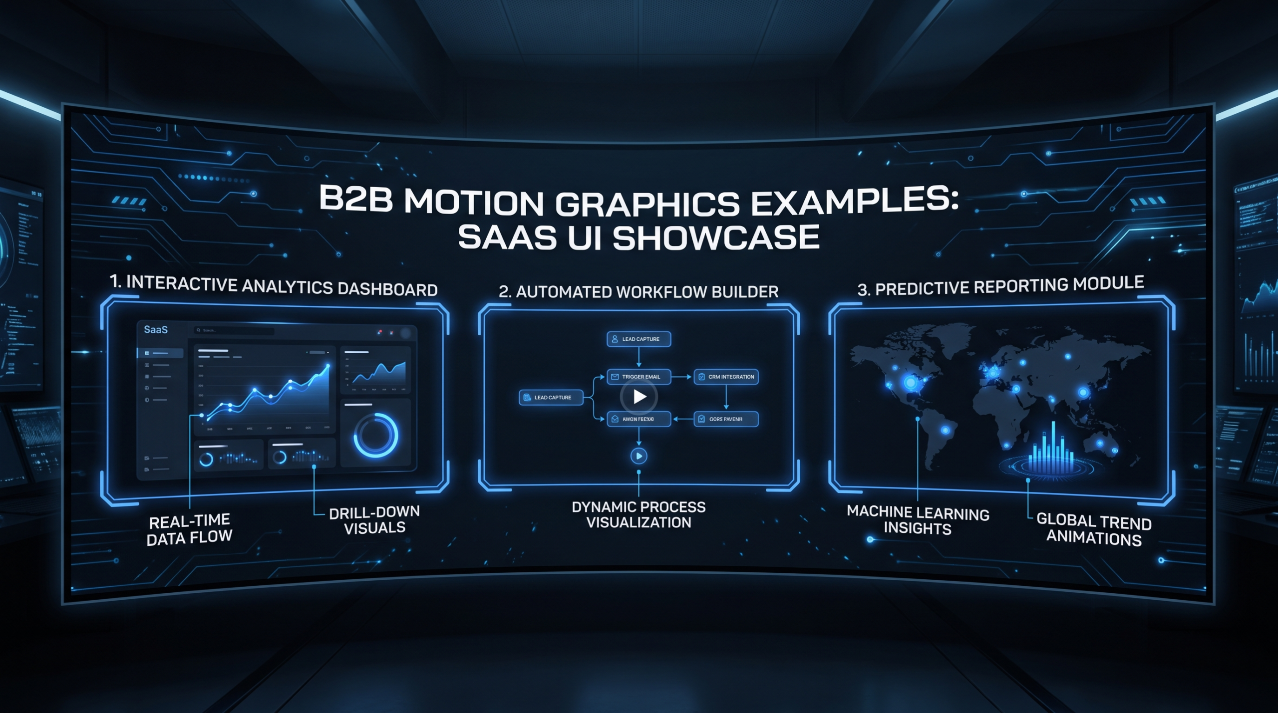
Stripe's motion graphics approach reflects their developer-first, data-rich brand. Their animated content — primarily in product marketing pages, conference presentations, and feature launch videos — uses animated data visualizations: flowing transaction streams, real-time dashboard charts updating, payment flow diagrams with animated path tracing.
What They Did
Stripe's feature pages use looping micro-animations to show their product working at scale. Their Radar fraud detection feature, for example, is visualized through animated network graphs showing transaction patterns being analyzed in real time — an abstract process made tangible through motion. Their developer documentation uses subtle animation to show API calls and responses, making technical concepts more intuitive.
At Stripe Sessions (their annual conference), motion graphics are used to show macro business trends — revenue curves, conversion rates, churn reduction — giving their storytelling a data-driven authority that aligns with their audience's analytical mindset.
Why It Works for B2B
For infrastructure and fintech products, the buyer is often technically sophisticated and skeptical of marketing polish. Stripe's data visualization animations signal competence rather than salesmanship — they show numbers in motion, not abstract metaphors. This approach respects the audience's intelligence while making complex systems visually legible.
What to Steal
If your product generates data (and most B2B products do), animate the data. Show dashboards building in real time, conversion rates climbing, latency dropping. Animated metrics are more persuasive than static screenshots of the same numbers because they imply the data is live, dynamic, and earned — not cherry-picked for a static presentation.
Learn more: stripe.com/resources
10. Loom — Explainer-First for a Video-Native Product
Loom faces a unique motion graphics challenge: they sell a video product, so their own marketing videos are inherently a product demonstration. Their motion graphics approach leans into this — using animated screen recordings with overlaid motion graphics to show exactly what Loom videos look like to recipients, while simultaneously explaining why that experience is valuable.
What They Did
Loom's feature animations show the full Loom workflow in motion: a sender recording their screen, the notification arriving in the recipient's inbox, the viewer watching with reactions appearing in real time, and the async reply thread that follows. The motion graphics function as a meta-demonstration — they're using animated video to show how video replaces meetings.
Their onboarding animations are particularly effective: they show common work scenarios (giving code review feedback, reviewing a design, onboarding a new hire) as animated storyboards where the "without Loom" version shows a meeting invite being sent, and the "with Loom" version shows a 3-minute video replacing a 30-minute call.
Why It Works for B2B
The before/after animated format — showing the problem state and the solved state — is one of the most effective structures in B2B motion graphics. It's especially powerful when your product replaces a behavior your audience already finds painful. Loom's animations don't explain what async video is; they show why anyone would want it.
What to Steal
Build a before/after motion graphics sequence for your most compelling use case. Show the painful "before" state clearly — the frustration, the inefficiency, the cost — then contrast it with the clean "after" state your product creates. The emotional contrast does the selling; the product features are just evidence.
See their product page: loom.com/product
Lessons From All 10 Examples
Across ten different companies, ten different products, and ten different animation styles, five patterns appear in every effective B2B motion graphics example:
- The animation style matches the brand promise. Notion is minimal; Stripe is data-driven; monday.com is bold. The motion reinforces what the brand says in words.
- Complexity is clarified, not demonstrated. None of these videos try to show every feature. Each picks a single concept or use case and makes it visually obvious.
- The first 5–10 seconds establish the viewer's problem. Every example opens with something the target buyer recognizes — a frustration, a task, a situation — before introducing the product.
- Runtime is disciplined. No example exceeds 5 minutes for a feature video. Most are 60–180 seconds. Shorter is harder to produce but performs better.
- Internal visual consistency. The animation style in marketing videos matches the product UI, which matches the website. Buyers feel oriented before they've signed up.
Motion Graphics Style Comparison Table
B2B Motion Graphics Styles at a Glance
| Company | Primary Style | Best For | Avg. Runtime |
|---|---|---|---|
| Slack | Animated product UI | Showing adoption ease | 60–90 sec |
| Dropbox | 2D illustrative explainer | Abstract benefits made tangible | 90–120 sec |
| HubSpot | Kinetic text + animated charts | Educational top-of-funnel | 2–4 min |
| monday.com | Bold color + live-action hybrid | Brand differentiation in crowded markets | 30–90 sec |
| Figma | Conference-grade product animation | Major feature launches | 2–5 min |
| Intercom | Dual-view UI + kinetic text | Multi-role products | 60–90 sec |
| Asana | Color-coded workflow animation | Visual organization products | 90–180 sec |
| Notion | Minimal UI build animation | Flexible / customizable tools | 60–120 sec |
| Stripe | Animated data visualization | Developer / fintech audiences | 90–180 sec |
| Loom | Before/after storyboard animation | Behavior-change products | 60–90 sec |
What B2B Motion Graphics Cost in 2026
Production cost varies widely based on style, runtime, and who makes it. Here are the realistic ranges for B2B SaaS teams — not the fantasy numbers in agency pitch decks, and not the "my cousin does it for $500" underestimates.
For a detailed breakdown by video type and production tier, see the motion graphics pricing guide — it covers per-video rates, monthly retainer models, and what drives cost up or down across animation styles.
B2B Motion Graphics Cost by Style (2026)
| Style | Freelancer | Mid-Tier Agency | Dedicated Team (Monthly) |
|---|---|---|---|
| Animated product UI (60 sec) | $800–2,500 | $3,000–6,000 | Included in retainer |
| 2D illustrative explainer (90 sec) | $1,500–4,000 | $5,000–12,000 | Included in retainer |
| Kinetic text / animated charts (2 min) | $600–2,000 | $2,500–5,000 | Included in retainer |
| Conference-grade feature launch (3 min) | $3,000–8,000 | $10,000–25,000 | Dedicated motion designer required |
| Data visualization animation (90 sec) | $1,200–3,500 | $4,000–8,000 | Included in retainer |
Teams producing motion graphics consistently — 4+ per month — typically find that a dedicated team or agency retainer costs 40–60% less per video than ordering individual projects. If you're budgeting for ongoing content, our pricing page covers VEC's dedicated team plans built for B2B SaaS content volume.
For context on what drives per-minute costs across the full market, the video editing cost per minute guide is a useful benchmark reference — particularly if you're comparing in-house rates against agency quotes.
How to Plan Your Own B2B Motion Graphics Campaign
Looking at 10 examples is useful. Knowing how to sequence your own production is more useful. Here's a practical framework for B2B marketing teams starting or scaling their motion graphics output:
Step 1: Anchor to a Use Case, Not a Feature
Choose one specific workflow your buyers find painful today. Not "our platform helps teams collaborate" — that's a category, not a use case. Specific: "our platform shows every stakeholder the same project status without a meeting." That's a use case you can animate.
Step 2: Choose the Right Animation Style for Your Audience
Map your audience type to the style examples above. Developers and technical buyers respond to data visualization and product UI animation (Stripe, Slack). Non-technical buyers respond to illustrative explainers and before/after formats (Dropbox, Loom). Mixed audiences often work best with kinetic text and chart animation (HubSpot).
Step 3: Script Before Storyboarding
Write the VO script first. Read it aloud — it should be under 150 words for a 60-second video, under 250 words for 90 seconds. Every sentence that doesn't earn its runtime gets cut. Only after the script is locked should you storyboard the visual sequence.
Step 4: Build a Visual System, Not One-Off Videos
The most efficient motion graphics programs create a visual system — a defined palette, type hierarchy, animation easing standard, and component library — that makes each subsequent video faster and cheaper to produce. VEC's dedicated team approach includes visual system setup in the onboarding phase so that by video 3, production time per video drops significantly compared to video 1.
For teams currently outsourcing video production, see our guide to outsourcing video editing — it covers how to brief external teams effectively so you get consistent output without constant correction cycles.
Step 5: Plan Distribution Before Production
Every B2B motion graphics asset needs a primary distribution channel decision before production begins: LinkedIn (16:9 or 1:1, 60–90 seconds, captions required), YouTube (16:9, 2–4 minutes, thumbnail matters), website embed (no autoplay if it affects load time), or paid video ad (first 3 seconds must work on mute). Each format has different production requirements. Decide first — don't produce one version and hope it works everywhere.
For teams building a systematic video program, see our overview of SaaS video production — it covers how to think about video types, sequencing, and distribution across the full content funnel.
Frequently Asked Questions
What is B2B motion graphics and how does it differ from B2C?
B2B motion graphics are animated videos designed to communicate complex products, workflows, or concepts to business buyers — typically decision-makers at companies evaluating software or services. The key difference from B2C is intent: B2C motion graphics drive emotional response and impulse; B2B motion graphics reduce evaluation friction and clarify ROI. B2B animations tend to be more precise, more product-specific, and more focused on workflow outcomes than brand feeling.
How long should a B2B motion graphics video be?
The optimal length depends on placement: for LinkedIn or paid video ads, 30–60 seconds typically performs best. For website feature pages or product demos, 60–120 seconds is the practical range. For educational content on YouTube or a blog, 2–4 minutes is sustainable if the content density justifies it. As a rule, if you cannot cut 20% of the runtime without losing critical information, the video isn't tight enough yet.
Should B2B motion graphics show the real product UI or use abstract illustration?
Show the real product UI when the product's interface is intuitive and self-explanatory. Use abstract illustration when the product's value is in the outcome rather than the UI (infrastructure products, process changes, behavioral shifts). A hybrid — real UI with motion graphics overlays highlighting key elements — works well for complex platforms where the interface benefits from guided attention. Look at the Slack (UI-forward) and Dropbox (illustration-forward) examples above as anchors for this decision.
How many B2B motion graphics videos should we produce per quarter?
For a Series A–C SaaS company with an active content program, 4–8 motion graphics assets per quarter is a realistic and effective volume. This typically covers one hero explainer video, two to three feature or use-case animations, and one to two educational pieces. Teams producing more than 8 per quarter typically benefit from a dedicated motion design resource — either in-house or through an agency partner — rather than managing individual project quotes.
What's the most common mistake B2B teams make with motion graphics?
Trying to explain everything in one video. The most effective B2B motion graphics cover a single concept, use case, or feature — and cover it completely. When marketing teams try to include the full product value proposition in a 90-second animation, the result is a video that communicates nothing clearly. Pick one idea, make it visually obvious, and produce more videos for the other ideas. Volume and focus together beat a single "comprehensive" video that never gets shared.
Ready to Scale Your B2B Motion Graphics?
VEC's dedicated team model gives Series A–C SaaS companies a senior editor + motion designer + project manager focused on their account — with a guarantee to double your video output in 90 days or month 4 is on us.
Book a Free Strategy Call See How It Works