Fintech Demo Video Examples That Convert
TL;DR
The best fintech app demo videos solve one trust problem above all else: they make financial software feel safe and simple to a skeptical audience. Leading fintech brands like Stripe, Wise, Plaid, and Brex each approach this differently — but all share the same structural moves: lead with the problem, show real product UI within 8 seconds, and resolve the trust objection before asking for a sign-up. Below, we break down 7 real examples, the anatomy that makes each work, and the production decisions behind the conversions.
Table of Contents
- Why Fintech App Demo Videos Are Different
- Anatomy of a High-Converting Fintech Demo Video
- 7 Fintech Demo Video Examples That Convert
- How the Top Fintech Demo Videos Compare
- Which Format Fits Your Fintech Product
- Production Decisions That Drive Conversion
- How to Create a Converting Fintech App Demo Video
- FAQ
Fintech demo videos live or die on a single variable: trust. Your product handles money — real people's money — and no amount of sleek UI or smooth animation erases that reality. The companies below have figured out how to address it head-on, and their demo videos convert because of it.
This guide breaks down real fintech app demo video examples from companies you can verify, explains the structural moves behind each, and gives you the production framework to replicate their results. If you're looking for a broader playbook on fintech video strategy, start with our fintech product demo videos guide — this post focuses specifically on examples and the conversion mechanics behind them.
Why Fintech App Demo Videos Are Different
Fintech demo videos face a higher trust bar than any other SaaS category. When you're showing a project management tool, the worst-case skepticism is "will this actually save me time?" When you're showing a banking app, the skepticism is "will this lose my money or get me hacked?"
That fundamental difference shapes everything: pacing, tone, what you show first, what you choose not to show, and how you handle social proof. A fintech demo that ignores the trust variable — that opens with a feature walkthrough instead of a problem statement — will underperform even if the product is genuinely superior.
The Three Trust Objections Every Fintech Demo Must Resolve
- Security trust: "Is my money safe here?" — resolved through compliance mentions, encryption cues, and institutional-grade language without becoming clinical.
- Complexity trust: "Is this actually as simple as they claim?" — resolved by showing real UI in motion, not animated mockups that hide friction.
- Legitimacy trust: "Is this a real company I can count on?" — resolved by named partners, regulated status, or recognizable logos in the social proof section.
The fintech demo videos that consistently convert address all three — usually within the first 30 seconds.
Anatomy of a High-Converting Fintech Demo Video
Before diving into specific examples, here's the structural template the best fintech app demo videos share. This is not a guess — it's the pattern that emerges when you watch the demos from the brands in this post and note what they have in common.
The Converting Fintech Demo Structure
| Timestamp | What Happens | Trust Problem Addressed |
|---|---|---|
| 0–8 sec | Problem statement or relatable pain point | Legitimacy — shows you understand the audience |
| 8–20 sec | Real product UI appears on screen | Complexity — shows the product is real and navigable |
| 20–45 sec | Core feature demonstration with narration | Complexity — shows the key workflow, no feature overload |
| 45–70 sec | Social proof, logos, or compliance cue | Security + Legitimacy — third-party validation |
| 70–90 sec | Clear CTA — sign up, book demo, or start free | All three — confidence to take next step |
Most converting fintech demos run 60–120 seconds. Longer than that and you lose the viewer before the CTA; shorter and you haven't resolved enough trust to earn the click.
7 Fintech Demo Video Examples That Convert
Each example below is from a publicly traded or Series B+ funded fintech company with a verifiable demo video on their website or official YouTube channel. No invented case studies.
1. Stripe — The "It Just Works" Demo
Where to watch: stripe.com (homepage and product pages feature interactive demos and short video overviews)
What makes it work: Stripe's product demos are famous in the B2B SaaS world for their restraint. They show real terminal output, real API responses, and real payment flows — nothing is mocked up to look easier than it is. The message is implicit but unmistakable: this is a serious infrastructure product for serious companies.
Structural moves to borrow:
- Opens with code, not a talking head — signals technical credibility immediately
- Shows a payment completing in real time — complexity trust resolved by demonstration, not assertion
- Uses brand logos of known Stripe customers (Shopify, Salesforce, Zoom) as background social proof
- CTA is "Start now" not "Book a demo" — low-friction entry for developer audience
Production quality: Screen-capture quality is pixel-perfect; motion is smooth with deliberate camera pulls. No stock footage. The brand identity carries through typography and UI color, not voiceover personality.
2. Wise — The "Real Numbers" Demo
Where to watch: wise.com (homepage video and their YouTube channel @Wise)
What makes it work: Wise (formerly TransferWise) built their brand on a single insight: banks lie about exchange rates by hiding a markup in the "mid-market rate." Their demo videos make this transparent with real math, showing what a traditional bank transfer costs versus what Wise charges — on screen, with actual numbers.
Structural moves to borrow:
- Opens with the villain — "banks charge hidden fees" — before showing any product
- Uses actual fee comparisons with named competitors (banks), which builds credibility through specificity
- App UI is shown in motion, not static screenshots — the simplicity of the transfer flow is self-evident
- Ends with a conversion-focused message tied to the specific amount saved, not vague savings claims
Production quality: Mix of UI screen recording and simple animated graphics for the fee comparison. Clean voiceover. No on-camera talent in most versions. This keeps production cost low and replicability high — the math is the star, not the production.
3. Plaid — The "Infrastructure You Never See" Demo
Where to watch: plaid.com (their developer documentation and product pages include flow demos)
What makes it work: Plaid's challenge is unique — they're B2B infrastructure. Their end users don't interact with Plaid directly; they interact with apps (Venmo, Robinhood, Betterment) that run on Plaid's rails. Their demos solve this by showing the developer experience alongside the consumer experience, making the value chain clear to both audiences.
Structural moves to borrow:
- Split-screen approach: what the developer builds vs. what the end user experiences
- Shows the "Link" authentication flow — the piece every Plaid partner embeds — so developers immediately understand the integration scope
- Uses logos of fintech apps built on Plaid (Venmo, Betterment, Acorns) as social proof — these are recognizable brands that resolve legitimacy trust instantly
- Technical documentation is linked directly from demo pages — signals this is a product for builders, not just buyers
4. Brex — The "Built for Scale" Demo
Where to watch: brex.com (product pages and campaign landing pages)
What makes it work: Brex targets CFOs and finance teams at Series A–C startups and enterprise companies — an audience deeply skeptical of "startup banking." Their demos lead with the workflow pain (expense reports, receipt reconciliation, vendor payments) before touching the product UI. By the time the product appears on screen, the viewer is already sold on the problem.
Structural moves to borrow:
- Problem-first opening: "Your finance team spends X hours per week on manual reconciliation" — no product shown until 15+ seconds in
- Dashboard walkthrough shows multi-entity support, policy controls, and spend limits — enterprise features that build trust with finance buyers
- Uses customer quotes with named executives and recognizable company logos, not anonymous testimonials
- CTA is audience-specific: "Get a demo" for enterprise, "Apply now" for startups
5. Chime — The "No Hidden Fees" App Demo
Where to watch: chime.com (homepage and app store listings on Apple App Store and Google Play)
What makes it work: Chime targets everyday consumers — not developers or CFOs. Their demo videos reflect this with a completely different register: warmer visuals, person-of-color representation, and a focus on the emotional outcome (financial freedom, no overdraft fees) rather than feature specifications. The app UI is shown but it's secondary to the feeling the product delivers.
Structural moves to borrow:
- Opens with a relatable frustration ("Why am I being charged $35 for a $5 mistake?")
- Shows the SpotMe feature — the no-overdraft-fee tool — in action, which immediately differentiates from traditional banks
- Uses real customer stories rather than manufactured scenarios
- Mobile-first framing: every UI shot is on a phone, not a desktop — matches the product's actual use context
6. Robinhood — The "Investing Made Simple" Walkthrough
Where to watch: robinhood.com (product pages and official YouTube channel)
What makes it work: Robinhood democratized retail investing, and their demo videos reflect that mission at every level. The language is non-jargon, the UI is shown in a simplified first-time-investor flow, and the content acknowledges the emotional barrier to starting ("You don't need thousands of dollars to start investing"). This positions the product as accessible, not just affordable.
Structural moves to borrow:
- Opens by naming the specific barrier: "Most people think they need a lot of money to invest" — directly addresses the objection before showing any product
- Fractional shares feature demonstration solves the "$1 investment" concept in under 20 seconds — the entire value proposition in one UI action
- Compliance language appears at the bottom of the frame throughout, not just at the end — this is subtle but important for financial product trust
- Music and pacing are upbeat without being aggressive — financial optimism without promise of returns (critical for regulated messaging)
7. Brainware / Numerated — The Enterprise Fintech Demo
Where to watch: numerated.com (product tour page for their bank lending platform)
What makes it work: Enterprise fintech demos for B2B platforms like bank lending software or treasury management face a unique challenge: the buyer (a bank executive) has never experienced a simple, fast digital workflow internally. Numerated's demo videos close this gap by showing the contrast — what a loan application takes today (days, paper, manual review) versus what it takes on their platform (minutes, digital, automated decisioning).
Structural moves to borrow:
- Before/after contrast at the start: "Traditional commercial loan process: 14 steps, 5+ days" versus "Numerated: one workflow, same day" — sets the stakes before product UI appears
- Shows the banker workflow AND the borrower experience — both personas in one demo, which handles a two-sided platform with a single video
- Compliance and audit trail features get dedicated screen time — this is what enterprise buyers actually care about
- No consumer-facing language — the vocabulary is "decisioning engine," "origination flow," and "portfolio monitoring" — which signals domain expertise to the target buyer
How the Top Fintech Demo Videos Compare
The following table compares structural and production decisions across these seven examples to help you identify which approaches fit your product and audience.
Fintech Demo Video Comparison: Structure + Production
| Company | Primary Audience | Demo Length | Opening Move | Social Proof Type | Primary Format |
|---|---|---|---|---|---|
| Stripe | Developers / CTOs | 60–90 sec | Live code / API output | Customer logos (enterprise) | Screen recording + narration |
| Wise | SMBs / individuals | 60–120 sec | Hidden fee comparison | Named bank comparisons | Animation + app UI |
| Plaid | Developers / fintech founders | 90–120 sec | Split-screen B2B2C flow | Partner app logos | UI walkthrough + technical |
| Brex | CFOs / finance teams | 90–150 sec | Workflow pain statement | Named executive quotes | Dashboard walkthrough |
| Chime | Consumer (underbanked) | 30–60 sec | Relatable frustration | Customer stories | Mobile-first app demo |
| Robinhood | First-time investors | 60–90 sec | Barrier naming | Simplified feature proof | App walkthrough + voiceover |
| Numerated | Bank executives | 2–4 min | Before/after contrast | Compliance/audit features | Guided product tour |
Which Format Fits Your Fintech Product
The format of your fintech app demo video should follow your audience and sales motion, not your preference for animation or live footage. Here's the decision framework.
Screen Recording + Narration
Best for developer-facing fintech products (payment APIs, banking infrastructure, data aggregation). The audience values technical accuracy over polish. A pixel-perfect screen recording with clean voiceover converts better than an animated mockup that hides the actual interface. See Stripe and Plaid as the reference models.
Animated Explainer + Real UI
Best for consumer fintech and B2B products with a strong conceptual differentiator (like a fee comparison or a novel workflow). Animation handles the concept; real UI handles the proof. Wise is the cleanest example of this hybrid approach. For a full breakdown of production costs in this format, see our product demo video production guide.
Mobile-First App Demo
Best for consumer banking apps, neobanks, and personal finance tools where the entire experience lives on a phone. All screen recordings should be on device mockups (not desktop), all CTAs should drive to app store links, and all social proof should be consumer-facing (reviews, ratings). Chime and Robinhood use this approach effectively.
Guided Product Tour (Long-Form)
Best for enterprise fintech — treasury management, banking software, lending platforms, compliance tools. Buyers at this level are doing deep due diligence and a 90-second video won't close the deal. Plan for 2–4 minutes with a structured chapter menu (many enterprise buyers skip to the section that matters to their specific role). Numerated's approach applies here.
Format Selection by Fintech Product Type
| Product Type | Recommended Format | Typical Length | Key Conversion Element |
|---|---|---|---|
| Payment API / developer tools | Screen recording + narration | 60–90 sec | Live API response / code output |
| Consumer banking / neobank | Mobile app demo | 30–60 sec | No-fee / instant access feature |
| SMB finance / expense management | Dashboard walkthrough | 90–120 sec | Before/after time savings |
| Investing / wealth platform | App walkthrough + voiceover | 60–90 sec | Low-barrier entry (fractional, $1 min) |
| Enterprise banking / lending | Guided product tour | 2–4 min | Compliance, audit trail, decisioning speed |
| B2B2C infrastructure (open banking) | Split-screen technical demo | 90–150 sec | Partner logo social proof + integration simplicity |
Production Decisions That Drive Conversion
After reviewing the examples above, certain production decisions emerge as consistently high-impact for fintech demo videos. These are not aesthetic preferences — they are conversion levers with a clear mechanism.
Show Real UI, Not Mockups
This is the single highest-impact production decision for fintech. When a product handles money, viewers are subconsciously watching for any sign the UI has been made to look simpler than it actually is. Animated mockups trigger that skepticism. Real product screen recordings, even if they're slightly less polished visually, outperform mockups in trust surveys conducted by SaaS video researchers at Wistia — audiences interpret real UI as a signal that the product is confident in its own experience.
For screen recording quality that reads as premium, work with a video editing team experienced in SaaS and fintech content. The difference between a $500 screen recording edit and a professional production is in the micro-details: clean cursor movement, deliberate zoom-to-action, color correction that keeps the product UI from looking washed out against dark backgrounds.
Handle Compliance Language Gracefully
Fintech demos often include required regulatory disclosures — risk warnings for investing products, data protection statements for banking apps. The mistake most fintech video teams make is dumping all compliance language in a text wall at the end. The better approach: weave relevant trust signals throughout the video (Robinhood's approach), and reserve the legal fine print for the video description or the landing page below the embed.
This isn't about hiding disclosures — it's about sequencing them so they reinforce trust rather than interrupt the demo flow. A well-timed "FDIC insured" or "bank-level encryption" cue at the right moment in a banking app demo converts better than a legal disclaimer title card at the end.
Match Pacing to the Buyer's Cognitive Mode
Consumer fintech buyers are in emotional mode — they're frustrated with fees or scared of investing. Your pacing should be warm, accessible, and benefit-focused. Enterprise fintech buyers are in analytical mode — they're comparing vendors, doing security reviews, calculating ROI. Your pacing should be structured, feature-specific, and evidence-backed.
Getting this wrong is more common than you'd think. A fintech startup targeting bank executives with a slick, fast-cut consumer-style demo signals that you don't understand enterprise buying behavior. The reverse is equally damaging — a slow, technical walkthrough for a consumer neobank will lose the viewer before the CTA appears.
The First 8 Seconds Are a Qualifying Statement
Every demo video that converts opens by answering an implicit question: "Is this for someone like me?" Stripe opens with developer code — developers stay, non-developers bounce (and that's fine — they weren't converting anyway). Chime opens with "tired of overdraft fees?" — their target audience leans in, others close the tab.
The first 8 seconds of your fintech app demo video should function as an audience qualifier, not a brand introduction. If your product is right for this viewer, the first 8 seconds should make them feel that recognition. If it's not, they should self-select out before you've wasted both their time and your ad budget.
How to Create a Converting Fintech App Demo Video
Here's the step-by-step process used by the production teams behind the examples above, distilled into an actionable framework.
Step 1: Define One Conversion Goal Per Video
A fintech demo video with multiple CTAs (sign up, book a demo, download the app, read the whitepaper) converts worse than a demo with one clear ask. Define the single action you want the viewer to take and design backward from that. For consumer fintech: app store download. For developer tools: sign up for free tier. For enterprise fintech: book a demo with a named sales contact.
Step 2: Script the Trust Arc, Not the Feature List
The instinct of most fintech product teams is to script a feature walkthrough — "First, you go to the dashboard. Then you click on Transfers. Then you enter the amount…" This fails because it treats the viewer as already sold on trying the product. They're not — they came to decide whether to trust you.
Script a trust arc instead: Problem → Why current solutions fail → How your product solves it → Proof it works → Call to action. Features appear in step 3, but they're serving the trust arc, not the other way around. For more on scripting the right narrative structure for SaaS and fintech demos, see our SaaS video production guide.
Step 3: Record Real Product UI at High Resolution
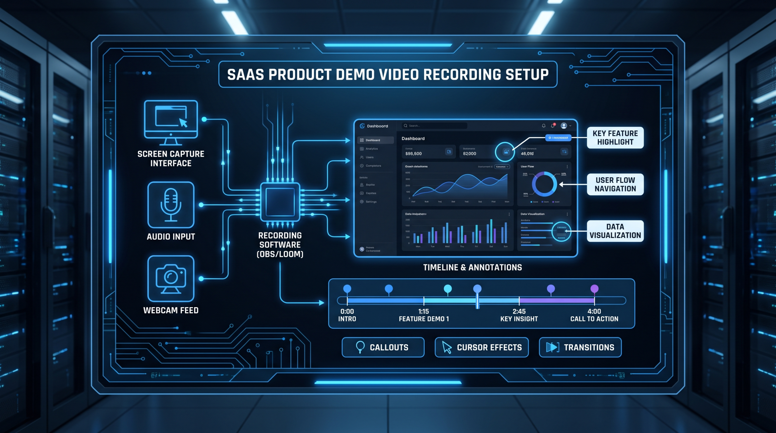
Record at 2x resolution (Retina/HiDPI) if possible. Export screen recordings at 1080p minimum; 4K for any video that will appear on large-format displays or in pitch decks. Avoid recording on a monitor with cluttered browser bookmarks, notification badges, or a non-standard system font — these are small details that undermine the professional quality of the final video.
Step 4: Edit for Pacing Before You Edit for Polish
The biggest production mistake in fintech demo videos is prioritizing visual polish over pacing. A beautifully color-graded video that loses the viewer at 45 seconds has failed. Cut every second that doesn't either advance the trust arc or demonstrate a key feature. The edits that matter most in a fintech demo are cuts, not effects.
Video Editing Company produces fintech app demo videos as part of our dedicated team model — with a senior editor and project manager assigned to your account, fintech content gets the domain-specific treatment it requires. See our pricing page for current plan details and what's included at each tier.
Step 5: A/B Test the Thumbnail and First Frame
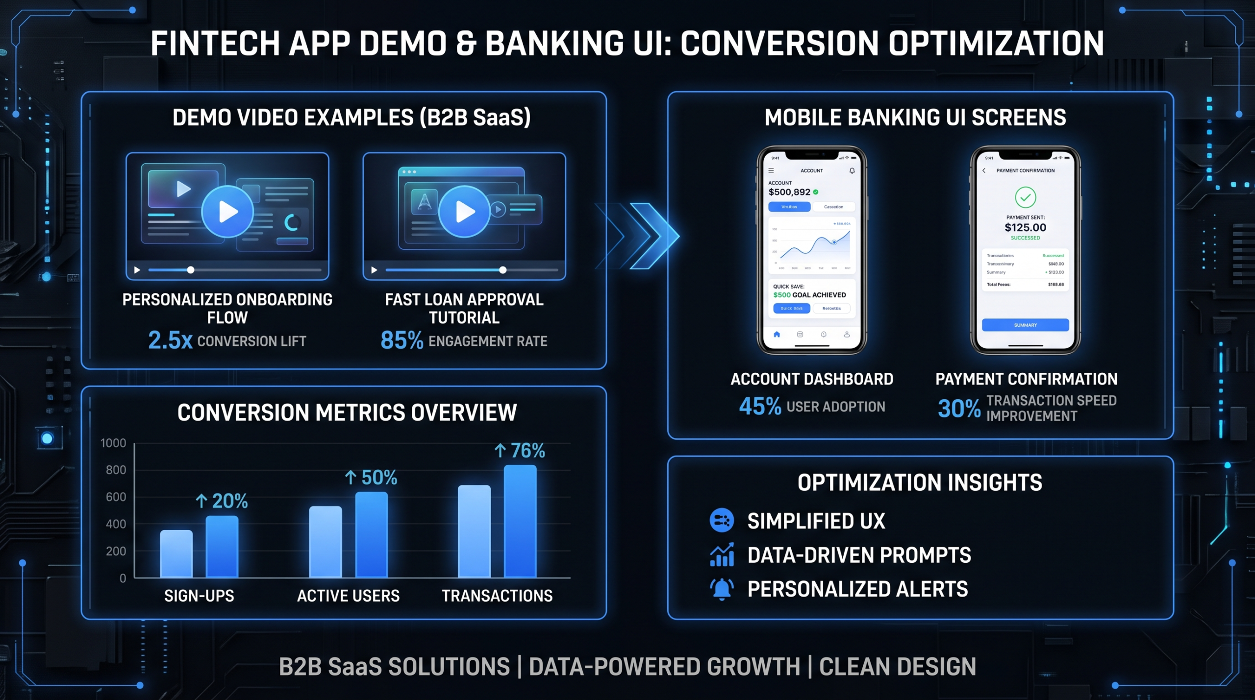
For embedded fintech demos on landing pages, the thumbnail determines autoplay and initial engagement. A/B test at minimum: (1) a UI screenshot showing the core feature versus (2) a graphic with the primary value proposition as text. For paid distribution on LinkedIn or YouTube, test the first 3 seconds as a hook variant — same content, different openings. Conversion differences between thumbnail variants can commonly run to 20–30% in B2B video tests, though results vary widely by audience and placement.
For the full production workflow including scripting, recording, editing, and delivery — particularly if you're managing multiple fintech video assets across a content program — our guide on how to outsource video editing covers how to set up an efficient production pipeline without hiring in-house.
Frequently Asked Questions
What makes a fintech demo video different from a regular SaaS demo video?
Fintech demo videos must resolve three trust objections that standard SaaS demos don't face: security trust (is my money safe?), complexity trust (is this really as simple as shown?), and legitimacy trust (is this a real, regulated company?). The structure, pacing, and social proof elements are designed around these objections. A generic SaaS demo template applied to a fintech product will underperform because it doesn't address the trust architecture that financial product buyers require.
How long should a fintech app demo video be?
Consumer fintech demos convert best at 30–60 seconds — the audience is making an emotional decision and you need to respect their attention. SMB and developer-facing fintech demos typically run 60–120 seconds. Enterprise fintech demos can run 2–4 minutes, particularly for complex platforms (banking software, lending origination, treasury management) where the buyer needs to see multiple workflows before engaging sales. Match length to the buyer's decision complexity, not your product's feature depth.
Should I use animated graphics or real product UI in my fintech demo?
Real product UI outperforms animation for fintech demos, particularly when your audience is sophisticated (developers, CFOs, bank executives). Animated mockups read as evasive to a skeptical buyer — if your product is as simple as you claim, show it. The exception is when your product handles a conceptual differentiator that's easier to visualize with animation (like a fee comparison or an open banking data flow) — in those cases, animation handles the concept while real UI handles the proof of simplicity.
How do top fintech companies handle regulatory compliance in their demo videos?
Leading fintech brands like Robinhood and Chime integrate compliance language as trust signals throughout the video rather than dumping a legal disclaimer at the end. Phrases like "FDIC insured," "bank-level encryption," and "regulated by [authority]" are placed at moments where they reinforce the viewer's confidence rather than interrupt the flow. Required legal disclosures should appear in the video description and the landing page below the embed — not as title cards that break the demo's momentum. Consult with your legal team on what must appear in the video versus what can live on the surrounding page.
What's the typical production cost for a fintech app demo video?
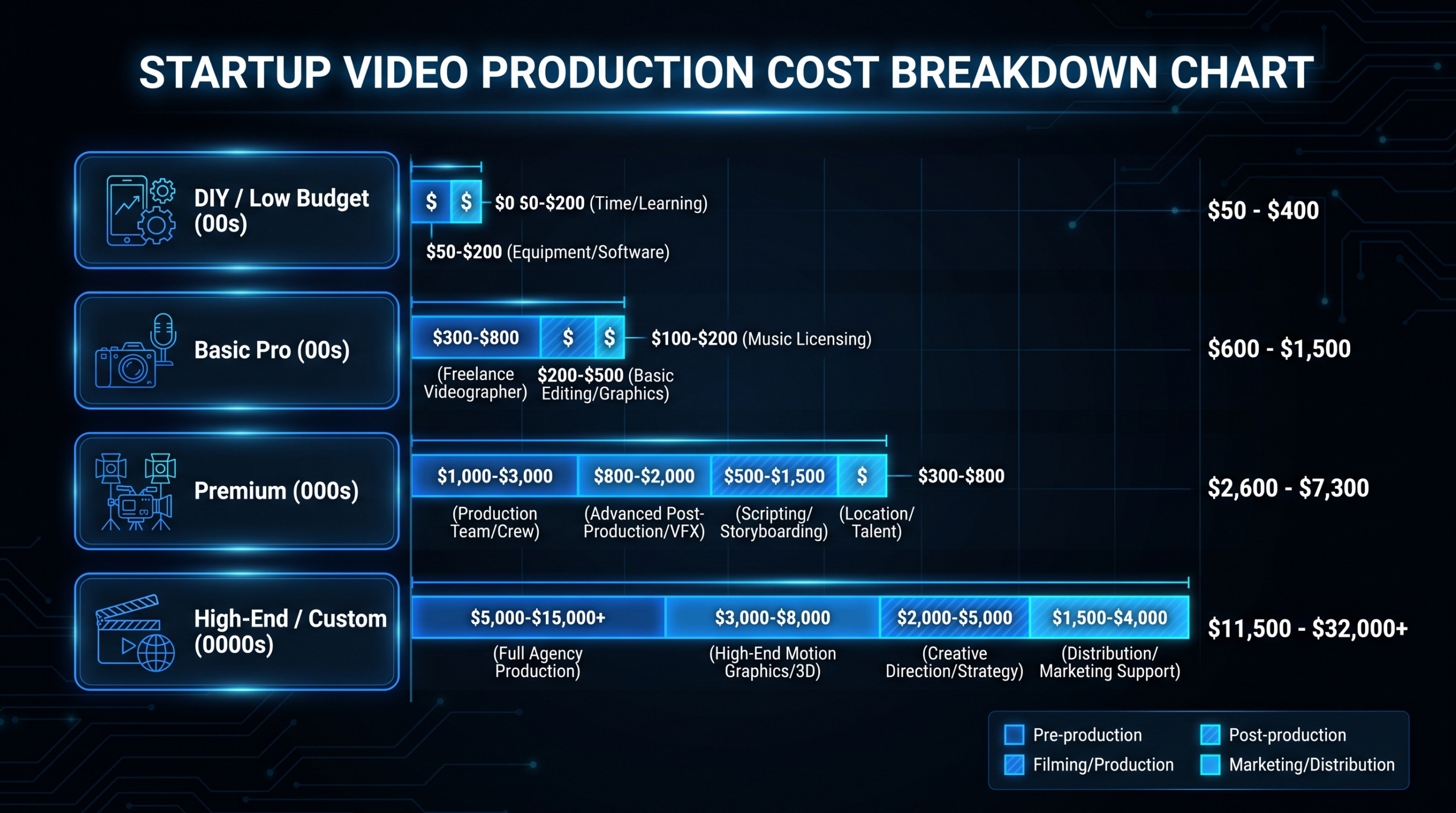
Production costs for fintech demo videos vary considerably by format and production approach. A screen-recording-based demo (Stripe / Plaid style) with professional editing typically runs in the range of $2,000–$8,000 per finished video from a specialized agency. Animation-heavy or on-camera demos (Wise / Chime style) with voiceover, motion graphics, and color grading commonly run $5,000–$20,000+. Enterprise fintech demos with multiple workflow sequences run higher. For a detailed breakdown of what drives these costs, see our product demo video production cost guide. Teams producing multiple fintech videos per quarter often find a dedicated video editing team — at rates starting around $5K/month — more cost-effective than per-project agency pricing.
Need a Fintech Demo Video That Actually Converts?
Video Editing Company works with fintech brands to produce demo videos that resolve the trust objections your buyers have before they ever reach your sales team. Dedicated editors, consistent brand voice, and a 90-day output guarantee.
Book a Free Strategy Call See Pricing